Through the various workshops that I participated in I feel that I have gained more knowledge and skills to communicate ideas in various forms.
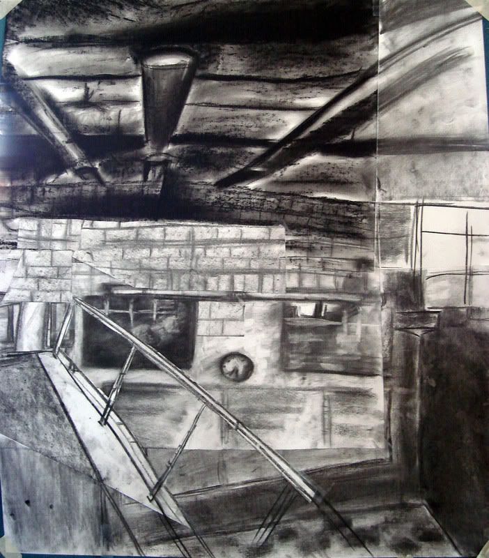
The first workshop I did was the Architectural Drawing workshop. The in-class activities were quick and easy tasks which encouraged us to allocate time logically and efficiently, not dwelling on minor tasks excessively. With the major presentation drawings I came to understand the difference between construction drawings and presentation drawings which presented a bit of confusion even till the end. The final challenge of the task was to learn how to personalise common drawings and images which I find is very opinionated in the successfulness of the approaches.
In Fluid Thoughts to Actions I found this workshop more enjoyable and fun which I think was a side from the more visual art nature of it was because of the collaborative tasks. Working in groups allowed for the flow of ideas and different ways of thinking and approaches to working together. The workshop focused on understanding the way light effected form and the ever presence of change and so I feel that I understand and appreciate more of what light and shadows do and can act as in drawings.
Lastly was Material Modelling. I find that this workshop really plays more practical, architecturally speaking. I think it focused more on problem solving as we looked at different ways to construct different forms such as scoring. Then using these crafting methods to express ideas and concepts. I enjoyed it very much although careful precision in cutting and gluing played on nerves as it became time consuming. Being more of a 'drawing' person as suggested by my first two workshop selections I am quite intrigued by how I seem to feel more a liking to this workshop than to the others. Which I assume is due to the practical and three dimensional aspects and qualities that seem to appeal.
Overall I seem to appreciate more the different ways of communication and its importance not only in architecture but also in many other professions and everyday situations.
Wednesday, October 22, 2008
Tuesday, October 21, 2008
Material Modelling
In-class exercises:
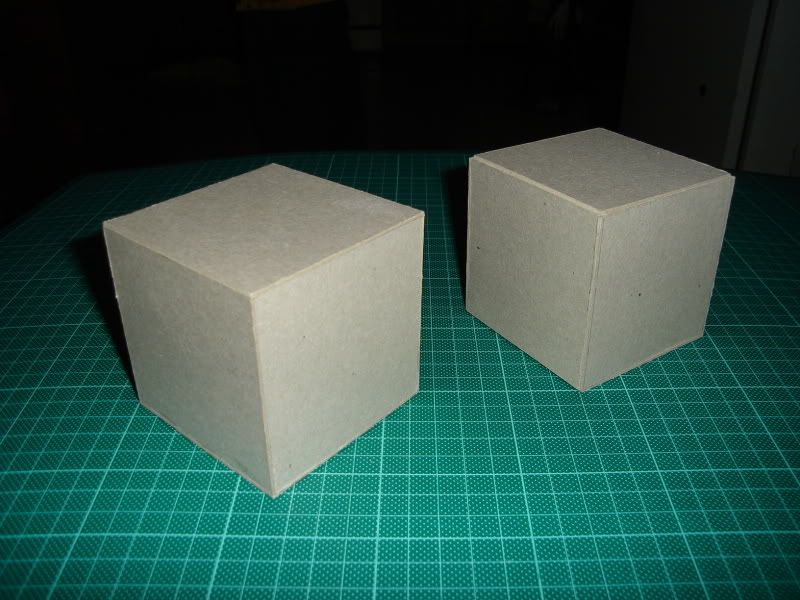
In this exercise we were to build perfect 8 x 8 x 8cm cubes, one by gluing 6 sides together and the second by scoring a net. In order to achieve perfection the thickness of the card had to be carefully considered. Sharp blades and non-excessive gluing was essential.
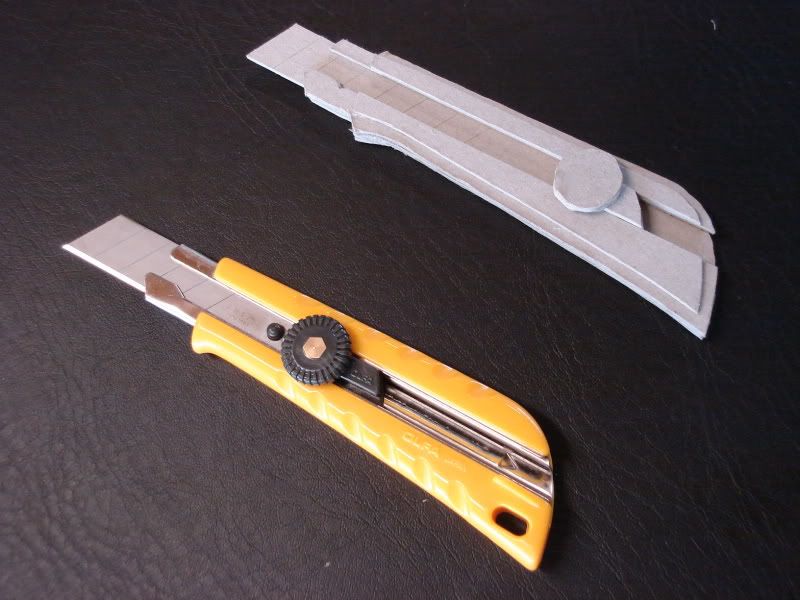
This task adapted the the basic skills gained in producing cubes to constructing more complex objects. Curved surfaces could be achieved through scoring quite easily, however for a curve filled object like this stanely knife my partners and I found it more easier o make through layer the card similar to building contours in models.
1:50 Sectional Model
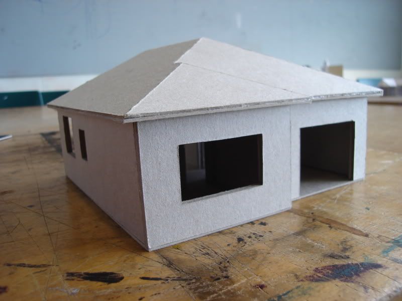
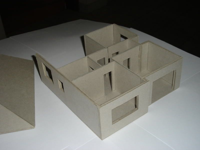
A 1:50 scale model of half of our homes were to be constructed using card. The focus of this task was on scaling particularly acknowledging the different thicknesses of internal walls and external walls.
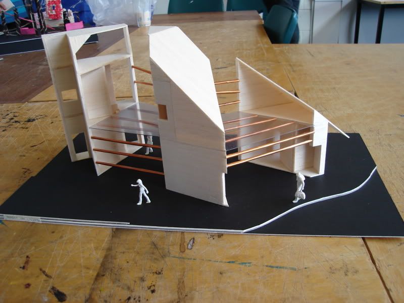
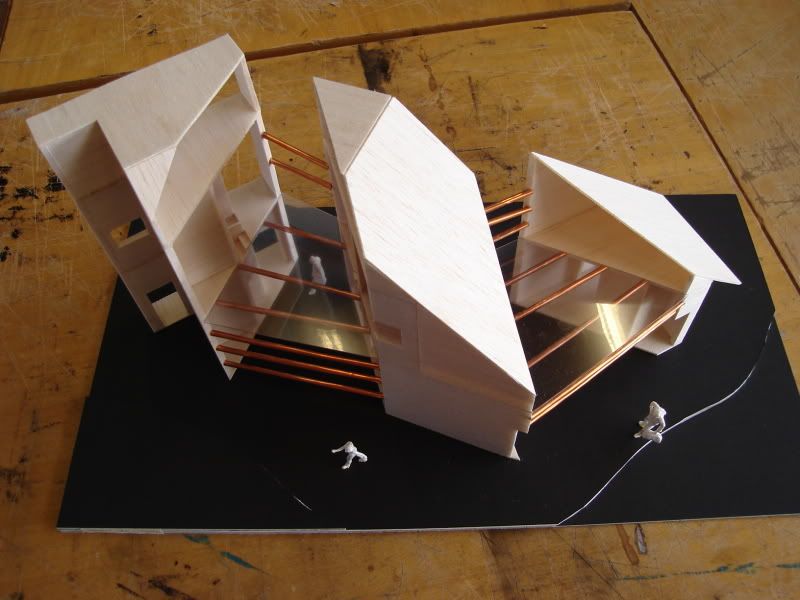
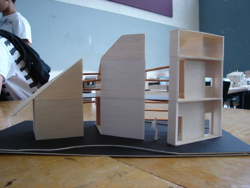
Transformative Action Model
The two tranformative actions which I performed on this model were: Slicing and Separating, and Attaching. In order to successfully carry out the actions the model had to show very obvious signs of the chosen action.
And so in my attempt in 'slicing and separating' I decided to cut the house into three sections diagonally rather than orthagonally, some what like slicing vegetables. I found that this highlighted the action more and also created interesting geometries from the existing roof.
Because this house is two storeys, 'slicing and separating' disconnected accessibility into the spaces of the upper floor. To resolve this problem the second action I choose was 'attaching' allowing me to re-connect the separate sections of the building. To emphasize a new action different materials were used. The structural connection was made using skewers wrapped in copper coloured brass sheets while acetate sheets were used to suggest glass flooring which bridged the separation of the building.
Perfect Cubes
In this exercise we were to build perfect 8 x 8 x 8cm cubes, one by gluing 6 sides together and the second by scoring a net. In order to achieve perfection the thickness of the card had to be carefully considered. Sharp blades and non-excessive gluing was essential.
Replica Object
This task adapted the the basic skills gained in producing cubes to constructing more complex objects. Curved surfaces could be achieved through scoring quite easily, however for a curve filled object like this stanely knife my partners and I found it more easier o make through layer the card similar to building contours in models.
1:50 Sectional Model
A 1:50 scale model of half of our homes were to be constructed using card. The focus of this task was on scaling particularly acknowledging the different thicknesses of internal walls and external walls.
Transformative Action Model
The two tranformative actions which I performed on this model were: Slicing and Separating, and Attaching. In order to successfully carry out the actions the model had to show very obvious signs of the chosen action.
And so in my attempt in 'slicing and separating' I decided to cut the house into three sections diagonally rather than orthagonally, some what like slicing vegetables. I found that this highlighted the action more and also created interesting geometries from the existing roof.
Because this house is two storeys, 'slicing and separating' disconnected accessibility into the spaces of the upper floor. To resolve this problem the second action I choose was 'attaching' allowing me to re-connect the separate sections of the building. To emphasize a new action different materials were used. The structural connection was made using skewers wrapped in copper coloured brass sheets while acetate sheets were used to suggest glass flooring which bridged the separation of the building.
Tuesday, September 16, 2008
ARCH1142: Fluid Thoughts to Actions
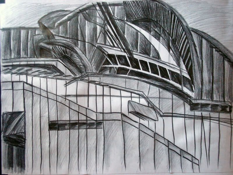
SYDNEY OPERA HOUSE
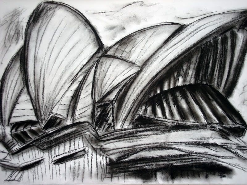
This first drawing is an attempt to represent the 'space' not the 'structure' of the Sydney Opera House. The focus was on the light and shadow created by the form while facing the changes of daylight.
The notion of change and movement is further explored as through the challenge of constant change of drawing locations with different perspectives of the subject. The drawing attempts to merge three drawings into one through the use of: overlapping, transparency and interpenetration of forms.
COLLABORATION DRAWING I
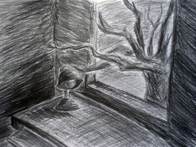
The drawing above is the product from a sole description of an unknown, unseen space provided by one person and depicted by another (me). The description follows.
Group Member Description of a Space:
The two sides of the walls are very dark since the sunlight can just reach into the room through one window. The sun is setting and it is turning into night. A tree stands in front of the window, thus blocks much of the view. A computer desk is below the window and there also a small lamp upon desk.
STILL LIFE DRAWING
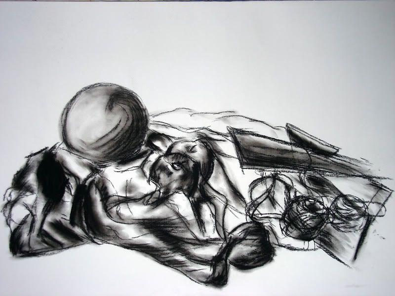
This still life here is no ordinary still life but a moving one. This may challenge the concept of what a still life may be but the explanation here is simple: we have an arrangement of objects which we draw, after a certain amount of time the objects are moved and we must cope with these parameters to produce a drawing. Hence a 'moving still life'. The challenge here are what choices shall be made to record these changes for the drawing to work as a whole.
LANDSCAPE DRAWING
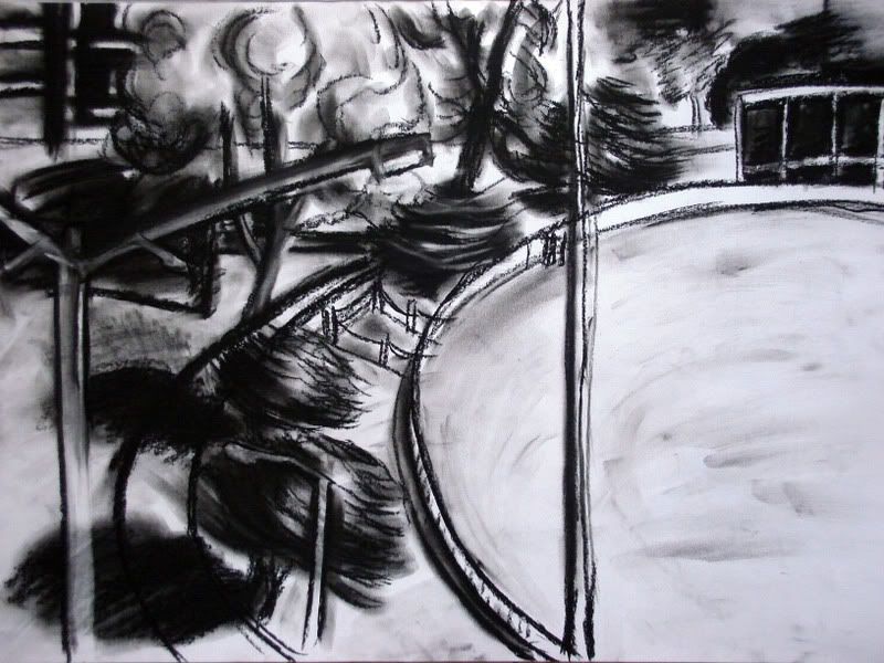
This drawing which you may or may not recognise is of the Village Green of UNSW looking from Level six of the Red Centre. The task was to look outside the window and simply draw the landscape that appears in front of you. The complication: choose an element within the landscape you have drawn and enlarge it on the page, whether it be by repetition by overlapping, transparency or interpenetration. In the above drawing I chose to enlarge the light post on the left simply because it was an insignificant element in stature in and amongst the drawing which I believed if enlarged would not cause too much disruption to the overall landscape. My choice of enlargement: overlapping.
COLLABORATION II
Part A
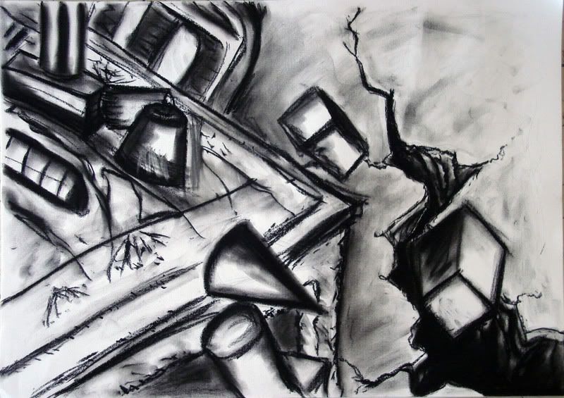 In our collaborative groups a first member was to produce an A4 drawing and give it to a second member who was to extend that drawing. The second was then to take an A4 section of the now new drawing and pass it to the third member, repeating the process until all four members had, had there turn in extension. The above drawing contains a section of the original extended drawing (top left corner) and a new interpretation of what the larger situation maybe, in this case a ground splitting earthquake.
Part B
 The four drawings produced by each member was to assemble to create on new larger drawing.
There were difficulties in doing so as each member seemed to have interpreted not only what was happening in the larger drawing differently but there was also some confusion of scale. The union of the four drawings was eventually based on the landscape of the common objects apparent in each individual depiction and the complete elimination of any distinction of four drawings. The final drawing much resembles an earthquake of some kind creating a focal point of suction in the center of the picture, drawing not only distinguishable objects but also the viewer's line of sight intensely to the middle.
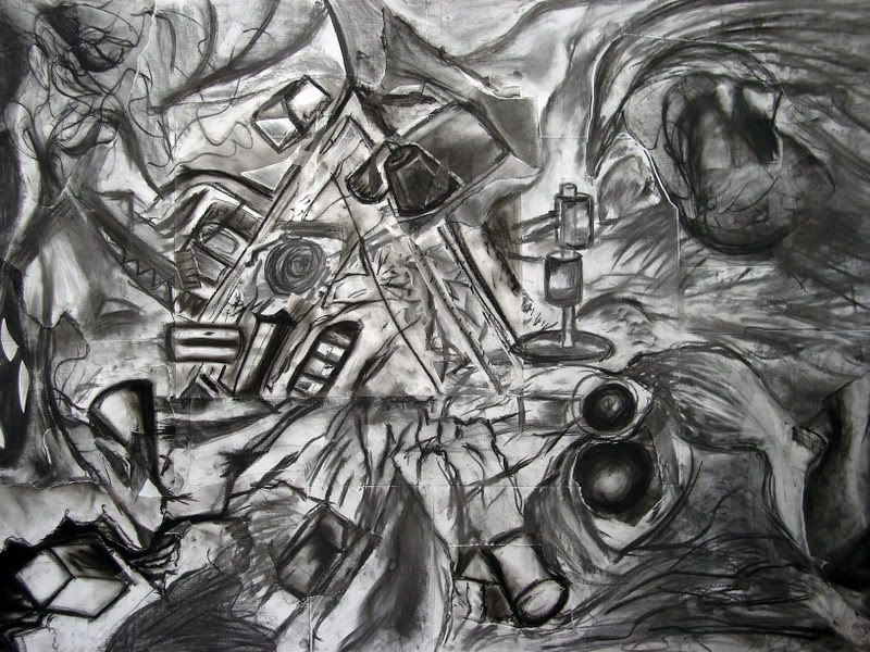
COLLABORATION III
In this final collaborative task we were to make a drawing of a 'hypothetical wall'. The task was rather free to interpretation. In this drawing my group members drew the same wall but in sections: top, middle and bottom and subsequently from different angles and in the end tried to piece it together. Again difficulties emerged from the varying angles which were ultimately resolved through the cutting up of one drawing, retaining the necessary and discarding unnecessary elements overall strengthened the cohesion of the finished drawing as a whole.
The notion of change and movement is further explored as through the challenge of constant change of drawing locations with different perspectives of the subject. The drawing attempts to merge three drawings into one through the use of: overlapping, transparency and interpenetration of forms.
COLLABORATION DRAWING I
The drawing above is the product from a sole description of an unknown, unseen space provided by one person and depicted by another (me). The description follows.
Group Member Description of a Space:
The two sides of the walls are very dark since the sunlight can just reach into the room through one window. The sun is setting and it is turning into night. A tree stands in front of the window, thus blocks much of the view. A computer desk is below the window and there also a small lamp upon desk.
STILL LIFE DRAWING
This still life here is no ordinary still life but a moving one. This may challenge the concept of what a still life may be but the explanation here is simple: we have an arrangement of objects which we draw, after a certain amount of time the objects are moved and we must cope with these parameters to produce a drawing. Hence a 'moving still life'. The challenge here are what choices shall be made to record these changes for the drawing to work as a whole.
LANDSCAPE DRAWING
This drawing which you may or may not recognise is of the Village Green of UNSW looking from Level six of the Red Centre. The task was to look outside the window and simply draw the landscape that appears in front of you. The complication: choose an element within the landscape you have drawn and enlarge it on the page, whether it be by repetition by overlapping, transparency or interpenetration. In the above drawing I chose to enlarge the light post on the left simply because it was an insignificant element in stature in and amongst the drawing which I believed if enlarged would not cause too much disruption to the overall landscape. My choice of enlargement: overlapping.
COLLABORATION II
Part A
In our collaborative groups a first member was to produce an A4 drawing and give it to a second member who was to extend that drawing. The second was then to take an A4 section of the now new drawing and pass it to the third member, repeating the process until all four members had, had there turn in extension. The above drawing contains a section of the original extended drawing (top left corner) and a new interpretation of what the larger situation maybe, in this case a ground splitting earthquake.Part B
The four drawings produced by each member was to assemble to create on new larger drawing.There were difficulties in doing so as each member seemed to have interpreted not only what was happening in the larger drawing differently but there was also some confusion of scale. The union of the four drawings was eventually based on the landscape of the common objects apparent in each individual depiction and the complete elimination of any distinction of four drawings. The final drawing much resembles an earthquake of some kind creating a focal point of suction in the center of the picture, drawing not only distinguishable objects but also the viewer's line of sight intensely to the middle.
COLLABORATION III
In this final collaborative task we were to make a drawing of a 'hypothetical wall'. The task was rather free to interpretation. In this drawing my group members drew the same wall but in sections: top, middle and bottom and subsequently from different angles and in the end tried to piece it together. Again difficulties emerged from the varying angles which were ultimately resolved through the cutting up of one drawing, retaining the necessary and discarding unnecessary elements overall strengthened the cohesion of the finished drawing as a whole.
Thursday, August 21, 2008
ARCH 1142: Drawing workshop: Presentation Drawings
Presentation drawings of Mario Botta's Lugarno House


Tuesday, August 19, 2008


Friday, June 20, 2008
UT Final Submission
Whoops!
I just realised I forgot to "Rebuild All" causing an unwanted tinge of lighting and evidently an extra large file size, twice as large in fact.
Here is my actual FINAL submission.

Disregard the 'final' one below.
For some reason my model seems to hide all the HUD displays automatically when I play. I don't know if its been saved onto my uploaded submission like that but just remember to fire to start play in case it doesn't tell you. (You know that it's begun when the red sparks appear.)
Oh and there's just one more thing about Versace's elevator which is that it stays stationary for 3 seconds after its done one loop even though I set it to 1. So don't worry it hasn't jammed you just have to be patient.
I just realised I forgot to "Rebuild All" causing an unwanted tinge of lighting and evidently an extra large file size, twice as large in fact.
Here is my actual FINAL submission.
Disregard the 'final' one below.
For some reason my model seems to hide all the HUD displays automatically when I play. I don't know if its been saved onto my uploaded submission like that but just remember to fire to start play in case it doesn't tell you. (You know that it's begun when the red sparks appear.)
Oh and there's just one more thing about Versace's elevator which is that it stays stationary for 3 seconds after its done one loop even though I set it to 1. So don't worry it hasn't jammed you just have to be patient.
Wednesday, June 18, 2008
UT submissions
Final

Draft two
Draft one
Sketch up models: Versace and Yin's elevators, dining table and Versace's circular room has been uploaded to Google warehouse.
Draft two
Draft one
Sketch up models: Versace and Yin's elevators, dining table and Versace's circular room has been uploaded to Google warehouse.
Tuesday, June 17, 2008
Final submission
Versace's tower of m&m's
No just kidding they aren't m&m's ...but she did say she loved "intense. solid swaths of colour."

Versace is a woman of boldness and grandeur in which I believe my tower has achieved. The idea of the tower is not only an expression of her aspiration for prestige but also in my opinion a place of recollection. Being at the top of the fashion world creates stress for the powerful mind she has and so the circular rooms should serve as places of repose. The tower is removed from the darkness and hectic life below. The irregular slits and cuts of the rooms however attempt to capture the radical behaviour of Versace as she is like no other even in states of comfort. The reason for her many office spaces is essentially: how could one have too many of one thing? Versace lives in luxury with lavish amounts of all consumer goods money can buy but there is also the idea that she doesn't stay put in one place for very long for the purpose of business.


Verace's elevator


Versace's elevator is an expression of pressure points. The spikes are a sign of her controlling and demanding behaviour in her work and her life. They are a portrayal of her aggression and competitiveness in the fashion world.


The Meeting Space


This meeting space is a neutral gathering of the personalities of the two clients suggested through their selective textures applied to the walls and the grandeur of the hall. The idea of the conference is derived from the notion of fire and the circular union of two separate powerful flames. The underlying concept is of peace and balance. With balance and fairness in mind you may feel that this space seems to emit the personality of Yin more but balance is made in harmony in large as Versace has taken the position of above.


Yin's boxes
Being the savvy business woman Yin is she knows "when to reward and and when to punish."

Essentially I have designed Yin's office as a series of three spaces as to portray her process of management. The idea is of a room for her office, a room of encouragement and lastly a room of discipline. The spaces hold a strong sense of simplicity and a feeling of traditional belonging. Though Yin's source of wealth is largely driven by the US she remains largely unknown in the western world and so her own culture is more dominant in the design. Yet subtle western connections are made such as the glass covering between the traditional Chinese window pattern normally rice paper. The reason for her largely unknown status is her modestly and intension to stay hidden. This has been replicated through the thickness of the walls, the single access to her office via the lift and also the maze-like nature of darker rooms which are simply not for show.


Yin's elevator


Yin's elevator attempts to portray her military family background. Power is expressed through its scale, span and mechanical nature of brutality and discipline in angular form.
No just kidding they aren't m&m's ...but she did say she loved "intense. solid swaths of colour."
Versace is a woman of boldness and grandeur in which I believe my tower has achieved. The idea of the tower is not only an expression of her aspiration for prestige but also in my opinion a place of recollection. Being at the top of the fashion world creates stress for the powerful mind she has and so the circular rooms should serve as places of repose. The tower is removed from the darkness and hectic life below. The irregular slits and cuts of the rooms however attempt to capture the radical behaviour of Versace as she is like no other even in states of comfort. The reason for her many office spaces is essentially: how could one have too many of one thing? Versace lives in luxury with lavish amounts of all consumer goods money can buy but there is also the idea that she doesn't stay put in one place for very long for the purpose of business.
Verace's elevator
Versace's elevator is an expression of pressure points. The spikes are a sign of her controlling and demanding behaviour in her work and her life. They are a portrayal of her aggression and competitiveness in the fashion world.
The Meeting Space
This meeting space is a neutral gathering of the personalities of the two clients suggested through their selective textures applied to the walls and the grandeur of the hall. The idea of the conference is derived from the notion of fire and the circular union of two separate powerful flames. The underlying concept is of peace and balance. With balance and fairness in mind you may feel that this space seems to emit the personality of Yin more but balance is made in harmony in large as Versace has taken the position of above.
Yin's boxes
Being the savvy business woman Yin is she knows "when to reward and and when to punish."
Essentially I have designed Yin's office as a series of three spaces as to portray her process of management. The idea is of a room for her office, a room of encouragement and lastly a room of discipline. The spaces hold a strong sense of simplicity and a feeling of traditional belonging. Though Yin's source of wealth is largely driven by the US she remains largely unknown in the western world and so her own culture is more dominant in the design. Yet subtle western connections are made such as the glass covering between the traditional Chinese window pattern normally rice paper. The reason for her largely unknown status is her modestly and intension to stay hidden. This has been replicated through the thickness of the walls, the single access to her office via the lift and also the maze-like nature of darker rooms which are simply not for show.
Yin's elevator
Yin's elevator attempts to portray her military family background. Power is expressed through its scale, span and mechanical nature of brutality and discipline in angular form.
Subscribe to:
Posts (Atom)
